A few years ago I started a tradition of using a few charts, graphs and maps to illustrate our work. The idea is two-fold: First, some people take in visual data better than they do a written-out story. And while I spend a lot of time writing and researching these posts and emails, it’s nice to look at things in a different format sometimes. Second there’s an old saying “Don’t mess with us, we have charts and graphs to back this s–t up.”
So with that in mind, here’s this years edition: 3 graphs, 1 chart, 2 maps and a little bit of explanation (plus links to the research) to describe our work for 2022. And yes, before you scroll on too fast, this is a request to chip in and support our work. If you can give time, energy, enthusiasm or anything else but not money – of course please do that too.
Here’s a video summary – if you want to listen, rather than read or scroll along.
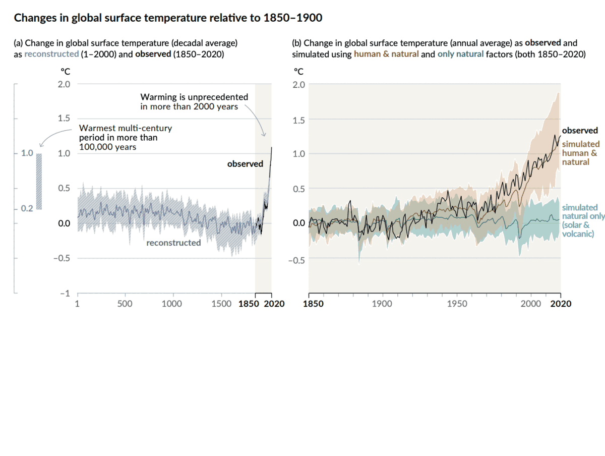
Let’s start with a graph from the UN’s annual climate report – this year’s nicknamed the “Code Red” report.
This probably doesn’t need a lot of explanation, but the news on climate change is still fundamentally bad, and alarming. We’ve already pushed the planet’s temperature to unprecedented levels in 2000 years, and the hottest 100 years in the entire history of the planet. Whats more, since all the unprecedented warming starts after 1850 (when the industrial revolution started) scientists are sure that climate change is real, that human activity – specifically burning fossil fuels – causes it, and it’s accelerating out of control.
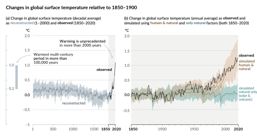
But the news this year wasn’t all bad – President Biden took office on Jan 20,2021, and promptly re-dedicated the US to climate action. He dod some great stuff right out of the gate – like canceling the Keystone XL pipeline, and he made a big commitment on earth day in April 2021:
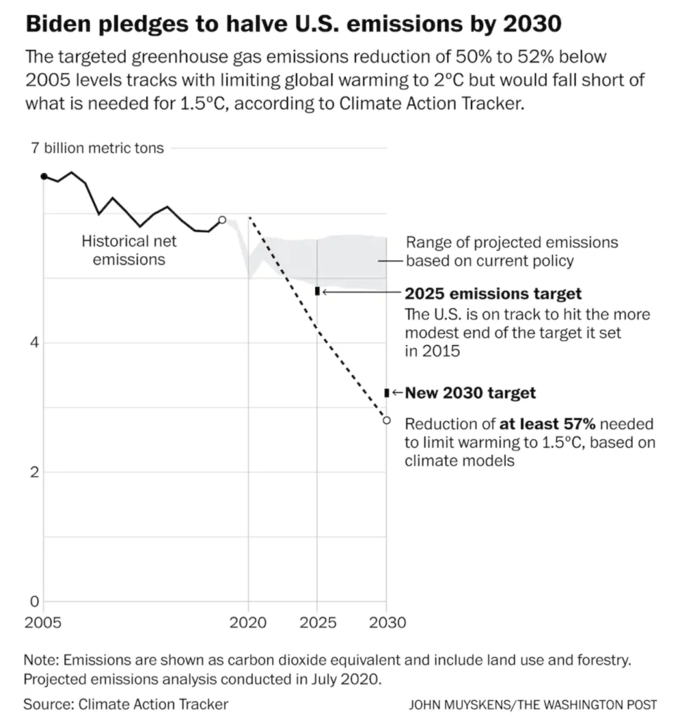
That’s a good start – and goes farther than the 30% reduction by 2030 that President Obama had promised when Biden was vice-President. President Biden also promised to reach “net zero” global warming pollution by 2050, which sounds pretty good as well. But as with most climate promises from US presidents, it needs a little context to be matched up to what scientists are saying is necessary. The chart above is from a Washington Post story on Biden’s commitment – but check the source. Climate action Tracker is an independent NGO that reviews and rates countries’ climate pledges, and their actions. And their assessment of Biden’s work so far is clear:
That’s a busy chart, but you get the idea: Biden’s Climate plans are good, but not sufficient to meet the goals of the Paris Climate Agreement. more to the point – they’re just words at this point. Biden wants to cut pollution almost sufficient to make a difference, but his actual policies to date are insufficient – and will lead to a 3c or hotter world.
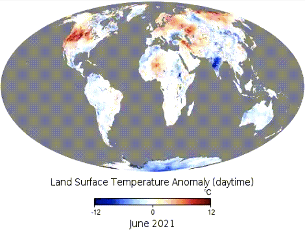
But wait, what’s the difference between a 1.5c hotter world and a 3c hotter world, you ask? We got a preview this summer – in June. A massive heat dome settled over the pacific Northwest and western Canada, spiking global temperatures hotter than they’ve ever been recorded – hotter than110 F in parts of the world that don’t even have air conditioning because it’s just never been this hot -ever. Bill McKibben did a lovely job summing up global alarm – see if you can spot June 2021 in this video from NASA:
If not, here’s the slide in question:
That heat wave, combined with President Biden’s promises to act on climate before those kind of disasters (and lots more – this was another record-breaking year for wildfires, Hurricanes, and we’ve continued to see climate-fueled weather disasters, like December’s big Tornados, all year) got people talking, and demanding action. So all summer and fall we fought for climate action that meets the scale of the crisis.
The big result of all that work was the Build Back Better Act – which proposed to invest $555 billion on climate action, the biggest in US history. But, like before, there’s a catch; Two actually, as illustrated in this new report from the World Resource Institute released just this month:
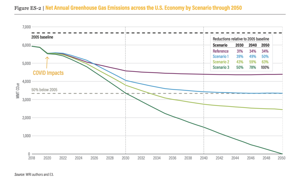
This one’s a little hard to read without the whole report to I’ll explain: the purple line, Reference, is how much global warming pollution the US will emit if we do nothing at all. The Blue line, Scenario 1, shows what Biden has committed to doing so far with the infrastructure bill, canceling Keystone XL, changing the US government’s purchasing power and other things that are already in motion. The first green line, Scenario 2, shows what will happen if the Build Back Better Act is passed. And the bottom Green Line, Scenario 3, is an imaginary future where we both pass the Build back Better Act, and then also do a bunch of other things that Biden has never even considered or proposed.
And there’s your two catches: First of all the Build Back Better Act is a long way from done – Manchin announced his opposition right before Christmas and nobody knows what, if any, action on climate change Congress will be able to pass. Second, even if they passed it, just as Biden proposed it – the biggest investment in climate action in US history – even with all that it wont even meet Biden’s climate pledge to cut emissions 50% by 2030. And remember, going back to our first 3 charts and graphs, Biden’s climate pledge wasn’t enough to meet our Paris Agreement goals – it got us closer (but not quite) to 2c of warming, and certainly nowhere near the 1.5c goal.
Which brings us to our last map, and our ask for money. It’s clear is that we’re going to need to do more in 2022 than we did in 2021. President Biden’s not pledging to act at the scale the climate crisis requires, yet. And he can’t even deliver on the promises he’s made, which includes not just the Build Back better Act but banning oil and gas drilling on public lands, addressing environmental justice systemically and consistently, and a lot more.
One of the big things we’ve focussed on in the second half of 2021 is the massive build-out of fossil fuel infrastructure in the Gulf and Permian Basin. As detailed in a brilliant, but harrowing, report form our friends in the Build Back Fossil Free coalition, fossil fuel extraction in this one region of the US will bust the climate and intensify environmental injustice from New Mexico to the Gulf of Mexico.
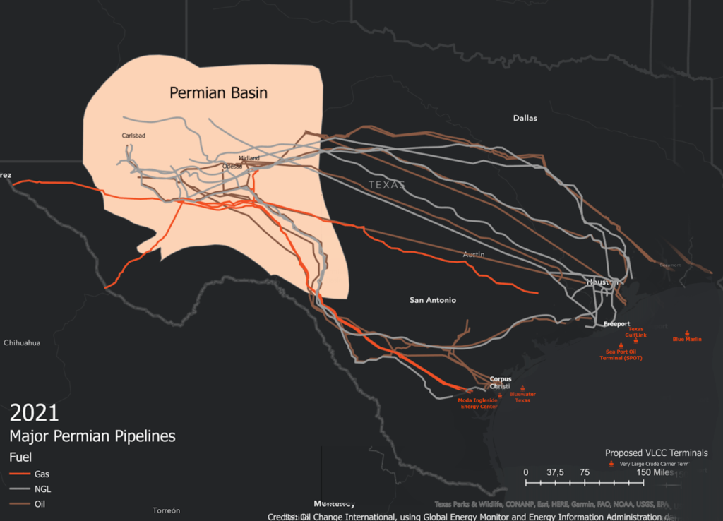
This last map is a little bit of a crude sketch of a project we’d like to tackle next year. That Permian Climate Bomb report illustrates (in addition to elucidating) the vast network of new pipelines, export terminals and more that are driving the climate crisis. For months we’ve wanted to build a bigger, interactive version of this information – something that shows all the pipelines, export terminals, refineries, gas liquefaction facilities, compressor stations, and more that are proposed or being built right now all over America. It’s just one map, one illustration. But like this whole post – we believe that one good illustration, graph or map can make a real difference in the fight to stop climate change.
The national map – interactive and online and open to all to add to, cite, reference or remix – is one of the 198 projects we want to launch next year. Others include going after Biden administration officials, legal actions, and supporting partner groups and coalitions just getting started in the fight against fossil fuels and climate chaos.
Pingback:Biden: Declare a climate emergency - 198 methods
Some of the resistance to change among the extremely small number of individuals who control the vast majority of the worlds money is that at least some are in the ego game of whose got the most. We are seeing a small piece of this in the Musk, Bezos, Branson space race. Bezos does not give a damn about anything except that, as we saw with his boast about Blue Origins’ launch after six Amazon workers were killed; and only later, after was he shamed for ignoring the tragedy, did he express his sorrow. later expressed his sorrow. (The building was constructed cheaply, according to Judd Legum, at Popular Info) Bezos seems to be the kind of person who just doesn’t think about people as actual human beings and he has a very narrow, tight focus on what he wants to accomplish that will reflect nicely upon his stature. Then there are those like the Koch tribe who seem to be hyper motivated to do as much damage as possible, not just to the environment, but to the fragile democratic-leaning institutions that we’ve inattentively relied upon. Those who have access and control over so much are well-known to each other and, while they might not like each other, their views of the world and their place in it are going to be similar. Shaming them may or may not work; if there are people important to them who can point out the flaws in their perception, which would be shaming, that might work better. The facts in this report, widely distributed to as many people as possible — especially high school and college age — will feel like sand in a bathing suit if there are enough places as well as people driving this info home. The day of 60 tornados should be framed (repeatedly) as the result of warming, for example. I’m also an advocate of calling this Climate Destruction or Destructive Climate Change — anything that highlights the reality. Calling it Climate Change is far too soft; and, as well know, the earth’s climate has changed any number of times, but not because of what we’v been doing.
I believe you mis-stated the intent of the annotations in the graphic titled “Changes in Global Surface Temperatures relative to 1850-1900″ above. We have NOT already pushed the planet’s temperature to ” … the hottest 100 years in the entire history of the planet”, … just the hottest in the last 100,000 years, (the previous interglacial period) as stated in the graphic. Much of earth’s history before 2-3 million years ago was much warmer than it is now, such as when the earth had no polar ice caps and sea levels were much higher than present. For example, see https://www.ipcc.ch/report/ar6/wg1/downloads/report/IPCC_AR6_WGI_Chapter_09.pdf, table 9.6, p 9-102.
This is a lot of real info we did not want to know! What can be done about those deniers only looking thru their own financial lens and not caring about those who will suffer most! We are all in this situation together and must change our lifestyles – NOW!